Wishing Everyone a Healthier, Happier, and Prosperous New Year: Care Safe’s Rebranding Journey
As we step into a new year, Care Safe is thrilled to share our rebrand—a significant milestone in our mission to enhance the well-being of the elderly community and reaffirm our steadfast commitment to safety and high-quality services. This transformation reflects the essence of who we are and our dedication to delivering compassionate care infused with joy and vibrancy.
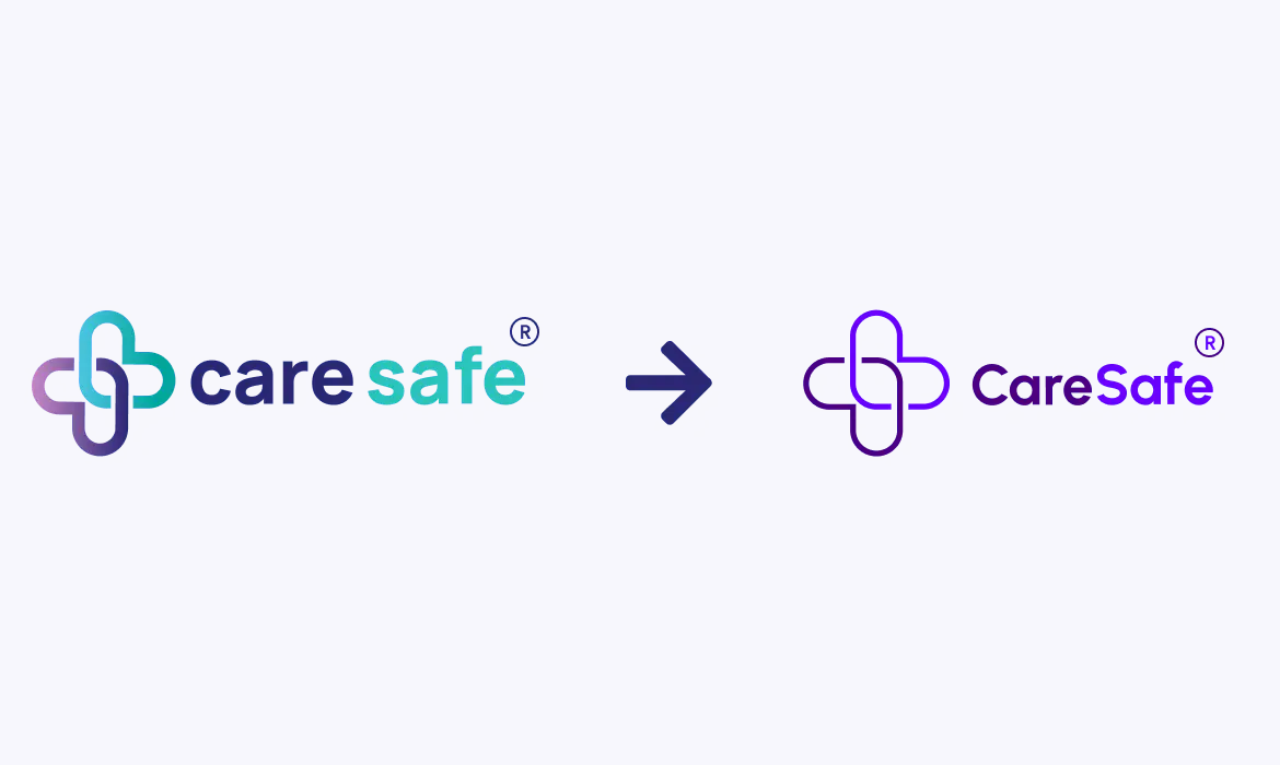
The New Purple: A Symbol of Joy and Vibrancy.
Our fresh branding introduces a vibrant purple colour scheme, symbolising the joy we aspire to bring to the elderly community. This colour, often associated with warmth and compassion, embodies our mission to create a nurturing environment for our service users. We believe everyone deserves care that not only fulfils their needs but also uplifts their spirits. Our vibrant palette reinforces our promise to inject positivity and happiness into every interaction.
A Heartfelt Commitment to Care
Our new logo features two interlocking hearts, representing our heartfelt dedication to the services we provide. This design illustrates our deep care for our service users, treating each individual with the respect and compassion they deserve. At Care Safe, our mission transcends traditional service delivery; it is about building genuine connections and ensuring the well-being of those in our care. Through this commitment, we strive to foster a safe and supportive environment for all.
Commitment to Safety and Quality.
Our rebranding underscores our unwavering dedication to the highest standards of safety and quality. The two hearts illustrate our commitment to maintaining regulatory compliance and quality assurance. Whether it’s upholding cyber security protocols or adhering to ISO standards, Care Safe prioritises the protection of our service users and their personal data. We are devoted to safeguarding their privacy and ensuring they receive services that meet stringent safety requirements.
Innovating for Our Communities.
The delicate intertwining lines of our new heart logo signify the innovation we are bringing to the doorsteps of our vulnerable communities and individuals with disabilities. At Care Safe, we continuously seek new ideas and technologies to enhance our services and ensure they meet the evolving needs of those we serve. Our goal is to provide not just care but innovative solutions that enrich our clients’ quality of life.
As we launch this exciting new chapter at Care Safe, we wish everyone a healthier, happier, and prosperous New Year. Join us in celebrating our rebranding—a reflection of our commitment to delivering services filled with compassion, joy, and safety. Our purple logo and the two interlocking hearts serve as a constant reminder of our values and the passion we have for caring for our community.
With a focus on high standards and innovative practices, Care Safe is not merely a service provider; we are a caring partner dedicated to enhancing the lives of elderly individuals, making a meaningful difference in their daily experiences. Together, let’s build a brighter, safer future for all as we embrace the opportunities the New Year brings.